Lenovo
A rejected mobile launch, recovered — by translating desktop faithfully, not reinventing it.
Lenovo was bringing two device launches to mobile, and the first round of concepts had already gone to the client and been turned down. This wasn’t a blank page — it was a recovery project, on a short turnaround, with a team that was raw from the rejection.
The first round strayed too far from desktop.
On their own the mobile ideas might have been fine, but in a coordinated device launch they broke the thing the client cared about: consistency. The messaging, branding, and tone of the desktop experience didn’t carry cleanly — Lenovo didn’t recognize their own launch in it, and they said no. My job was to close the gap without setting the project back to zero.
Approved and on-brand. That was the whole win.
The win condition was narrow and easy to underestimate: mobile pages that felt like a natural extension of the desktop launch — consistent in messaging and branding — and that the client would actually sign off on. Not novel, not award-bait. On-brand and approved, on a timeline that didn’t move.
How much of desktop did we actually need to bring across?
The first round failed by being too different, so the real question was degree. The answer turned out to be the more the better: treat the desktop sites as the source of truth and translate them down — same content architecture, same messaging hierarchy, same brand furniture — rather than reinterpret them for a small screen.
When whiteboard sketches weren’t landing, we used scissors.
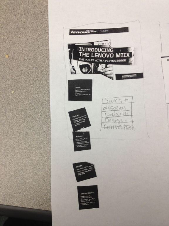
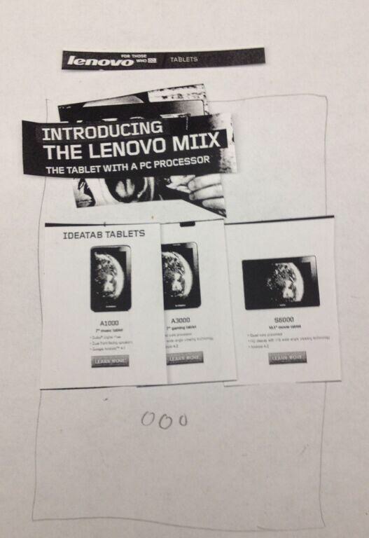
A nervous team couldn’t picture how a full desktop page would behave at phone width, and my whiteboard sketches were too abstract. So we switched to paper prototyping: printed the existing desktop pages at roughly half scale and physically broke them into how they’d stack on mobile — the Miix launch page cut into its modules and reassembled into a phone-height stack, the IdeaTab landing rebuilt the same way.
A persistent bottom nav — and one reused template.
A thumb-reachable bottom bar — Screen, Form, Camera, Power, 360 View, Video — anchored every page so a shopper could jump straight to whatever spec mattered. Mapping desktop’s sprawling nav onto a fixed bar was one of the few places mobile got to be better, not just smaller.
One product-detail template repeated across screens — header, a punchy copy line, description, phone graphic, Learn More — so the launch read as one coherent site.
Expandable phone drawers, brand-faithful chrome.
The landing page’s device drawers tapped to accordion open — image, short pitch, its own CTA — so the page held the same range of products the desktop site did without turning into an endless scroll. The Lenovo header, social links, and footer carried straight over, so nothing read as off-brand.
Landing · phone drawers
“Live a High res life”
“Thinner and Stronger”
“Point. Shoot. Love.”
Accordion expanded
The hardest part was interpersonal, not visual.
The team was raw from having their work rejected, and I was the outside consultant walking in after. So I didn’t blow up their work — I framed the shift as aligning with what the client had already approved elsewhere, making it about the desktop standard rather than their judgment. Paper prototyping turned a fraught “here’s what’s wrong” into a collaborative “let’s fold these pages down together.” Reading the room is part of the design brief.
When words and abstractions aren’t landing, put something in people’s hands.
The work delivered on its actual goal: a set of aligned, on-brand mobile wireframes that translated the desktop launch faithfully and gave the team a direction they could take back to the client with confidence, replacing the round that had been rejected.
This was a short, assist-style engagement — a couple of days to help a team over a hump — with no KPIs defined, so there are no launch metrics to point to.